Featured Content w/ Product List (Featured Catalog Products)
Layout Variant: C089
Content Type: Collection / Product Teaser / External Link / Placeholder
Teaser Title | Teaser Text | Pictures and Media | Items | CTAs | |
C089 Collection | Yes | Yes | Yes | Yes | No |
Product Teasers added to collection's "Items" | No | No | No | - | Yes |
External Link / Page added to product teaser's "Teaser Targets" | No | No | No | - | - |
Placeholder (layout variant "view-details-cta") added to product teaser's "Teaser Targets" | - | - | - | - | - |
Aspect Ratio
- 16:9, 1:1
Expected Use:
This component displays solutions and their related products in a standalone or tabbed functionality. Each solution includes a large image and description as well was a related products columns that contain images, titles, and a description for each related product.
This component is intended to be manually authored. There is no content that should be pulled dynamically from the catalog/Commerce platform.
An optional read more toggle can be added to the component, truncating the body copy to 5 lines of text by default. When the toggle is clicked, the rest of the content will appear below as normal. An optional background toggle can be enabled to display the collection with Legacy (Gray) background. Note: Each optional element is authorable individually and in combination with each other.
Building the Component:
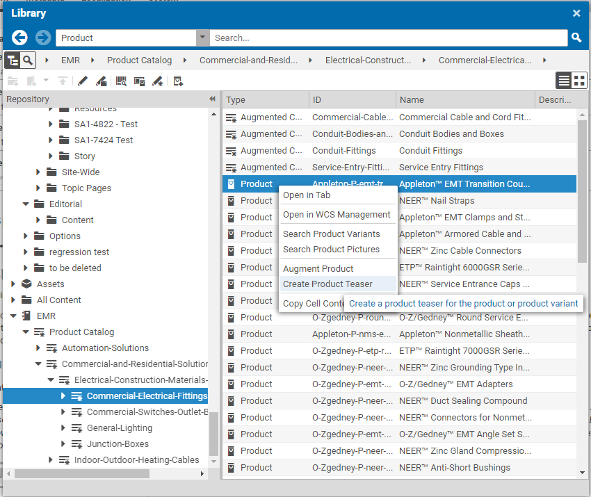
Create a Product Teaser document for each featured product to add to the component. This can be achieved in Studio library by navigating to the corresponding product in catalog and selecting "Create Product Teaser" from the product's context menu:
If filled, the Product Teaser's
- Teaser Title is used as a replacement for the product's name,
- Teaser Text is used as a replacement for the product's long description, and
- Pictures and Other Media is used as a replacement for the product's picture.
For the product's CTA button, link the target document in the Teaser Targets field of the Product Teaser. Depending on the intended button target, proceed as follows:
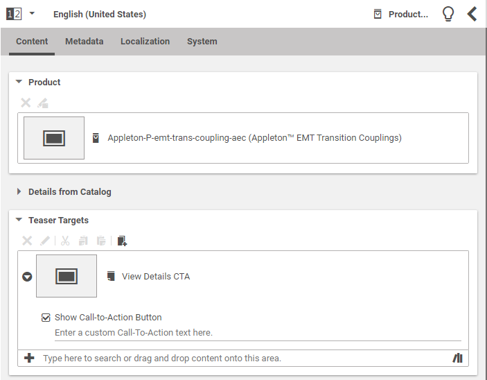
- "View Details" (PDP): link a Placeholder document with Layout Variant "view-details-cta".
- Other CoreMedia pages or external links: link the corresponding target Page or External Link document.
External Link documents may be reused across different Product Teasers, if target links are identical. A single central Placeholder document with Layout Variant "view-details-cta" may be used across all Product Teasers for this component. Expand the entry in Teaser Targets and check "Show Call-to-Action Button". Button text per default is defined by field Teaser CTA Label of the linked document. It may be overwritten by entering a custom text in the edit field below checkbox "Show Call-to-Action Button". For "View Details" CTA button, the button text is fixed.
At most one entry in Teaser Targets will be rendered as CTA button (the first one which has "Show Call-to-Action Button" checked).
See the following screenshot for an example of a linked Placeholder document activating the "View Details" CTA button:
Alternatively, a Teaser document can be used instead of a Product Teaser. In that case, Teaser Title, Teaser Text, and Pictures and Other Media need to be filled. If a Teaser is used, no product data from the catalog is displayed and no "View Details" CTA button can be rendered based on product data. In section Call-to-Action-Button, select "Use Linked Call-to-Action Label" and link a CTA button target document, if a CTA button is desired.
When all (Product) Teasers are set up, create a Collection document with Layout Variant C089. Add Teaser Title, Teaser Text and Pictures and Other Media to appear in the left column. Add desired (Product) Teaser documents to Items to appear in the "Related Products" column. In section Call-to-Action-Button, select "Use Linked Call-to-Action Label" and link a CTA button target document, if a CTA button is desired.
When translating the component's documents from English (United States) to any other locale, remember to adjust URLs in External Link documents. They are specific to English (United States) and will not be processed by the translation agency, nor can the system adjust them to the target locale automatically. Therefore, after reception of translated contents from the translation agency, open all translated External Link documents and adjust URLs to target region and language.
Resource Bundle
The following keys have entries in the "miscellaneous" resource bundle file.
Key | Description | Values |
view_details_cta | Text for "View Details" Call-to-Action button | View Details |
related_products_section_header | Header for related products section | Related Products |
show_less_products | CTA label to show less products displayed | Show Less Products |
show_more_products | CTA label to show more products displayed | Show More Products |
The above resource bundle properties were intended to showcase products using C089 component. If an author intends to use C089 for other purpose such as display of related articles, the author must create a new resource bundle file. Below are the steps to setup the resoure bundle and customize the sidebar and CTA labels.
1. Create a new set of resource bundle and label it as, for example, "relatedArticlesList".
2. Add the following string properties to replace desired CTA labels. Note that the bundle entries must still bear the same key property name as above but the values can be customized as preferred. Modifying the "related_products_section_header" property value cannot be done via this step. Refer to step 4 below. For example:
Key | Description | Custom Value |
show_less_products | Custom CTA label to show less info displayed | Show Less Articles |
show_more_products | Custom CTA label to show more info displayed | Show More Articles |
Note that if in case the author modifies the "view_details_cta" value from "View Details" to "View the Article", it will affect the view_details_cta of two or more C016s with C089 on the same page. This happens as the custom resource bundle added on the Localization tab of a page overrides the preset setting on the miscellaneous resource bundle file.
3. Add the "relatedArticlesList" bundle under the Localization Tab of the page where the C089 component is part of. The custom CTA labels will auto display on all C089 components.
4. To modify the Sidebar Label, add the following property on the Local Setting under the System Tab of each C089 component. Doing so, overrides the preset "Related Products" sidebar label value found under the "related_products_section_header" on the miscellaneous" resource bundle file.
Property | Value | Type |
eyebrowLabel | Related Articles | String |
Adding Optional Elements:
In order to 'turn on' the Read More so it is visible on the screen, add a boolean property 'readMoreDisplayed' to the component's Local Settings. If this property is checked, the Read More will be displayed. If this property is unchecked or it is not added in the Local Settings then the rest of the content will appear below as normal.
To add a short cut to "turn on" the Legacy (Gray) Background color, add a bolean property 'backgroundToggle' to the component's Local Settings. If this property is checked, then Legacy (Gray) background color will be displayed. If this property is unchecked or it is not added in the Local Settings then the background color is set to 'Default' (no color).


